Section 1: Theme Branding
Colors, Fonts, and Logos, Oh My!
Theme Fonts & Colors
In your Visual Design Editor, click on the Palette icon to access Theme Branding.
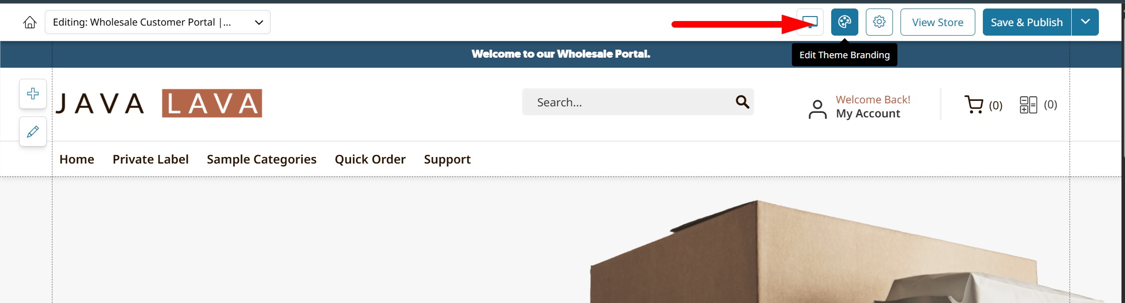
This will open your Theme Branding menu, shown below.
Theme Branding
Through the Theme Branding menu you can configure your store's Color Palette, Typography, and Global Styles.
Configuring your store's fonts, colors, and styles is an important step in its design.
Explore the settings within the Theme Fonts & Colors menu (Theme Branding) by clicking on any element. Read on to learn more about each section.
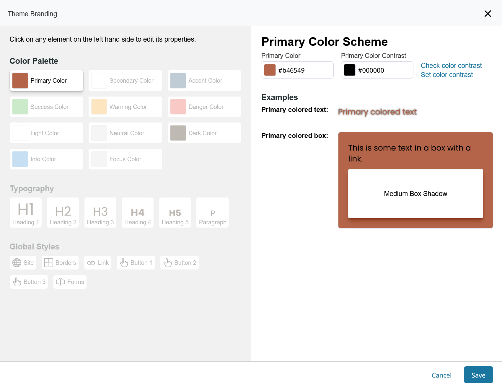
Color Palettes
The Color Palette section lets you choose standard colors to be displayed for each purpose on your store.
Each tile contains a color and how it is used on your store. For example:
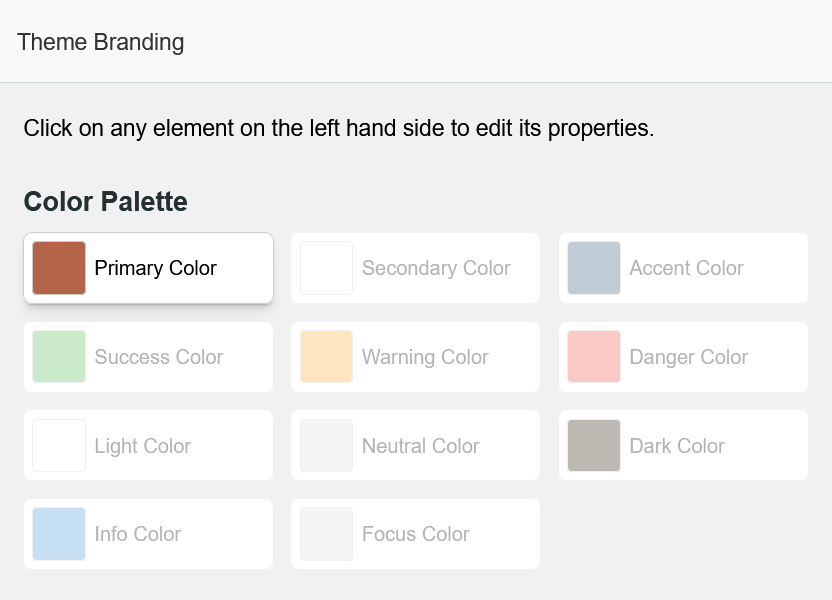
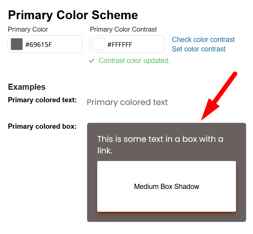
Primary Color
The Primary Color Scheme is used for just about all of the major drag & drop blocks in your theme as well as for all system pages that are not in your design editor (Shopping Cart, Login/Register etc...)
Secondary Color
The Secondary Color Scheme should compliment the primary color in your theme. Some designs utilize this secondary color for various parts of web elements (a.k.a. blocks) to give more variety and color to the theme.
Accent Color
The Accent Color Scheme is used similarly to the Secondary Color. It is used for Banners and more.
Alert Colors
The Success, Warning, and Danger Color Schemes are used for the standard Success, Warning, and Error messages seen throughout the store-front's user experience.
For example, add to cart success, checkout minimum warning, and out of stock error.
Changing your Colors
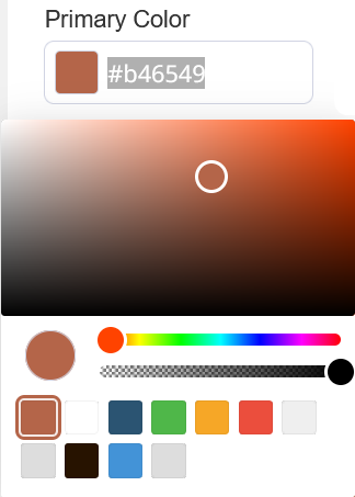
Clicking any of the colors in your palette will open the Color Scheme and presents the tools to modify it.
From there you can click into the color to change it via the color picker, or enter in your own hex code for the color.
You can also choose from existing colors set for other areas. Or adjust the transparency of the color displayed.
Color Contrast
Color Contrast controls the color of text which will be displayed on top of the color you are configuring.
For every color you choose in your design, you must consider how legible your text will be when displayed atop the color. The Check Color Contrast option will check this for you against WCAG Accessibility Guidelines.
Clicking Set Color Contrast will automatically set the recommended contrast color.
In the Examples area you will see a preview of how buttons and text will be displayed for elements which rely on the Color Scheme.
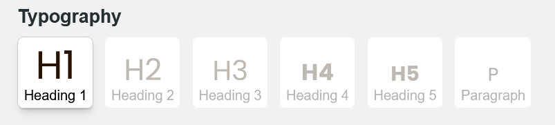
Typography
The Typography section is used for setting the Font styles for Headings, Paragraph text, Links, Buttons and form fields.
After selecting a text element to design, you can set the Font Size, Bottom Margin, Line Spacing, and Letter Spacing.
You can configure the Font Style to bold, italicize, and force upper-case.
The Font Family can be selected from our list of all Google Fonts. You can also upload custom Fonts to your Asset Manager to be selected here.
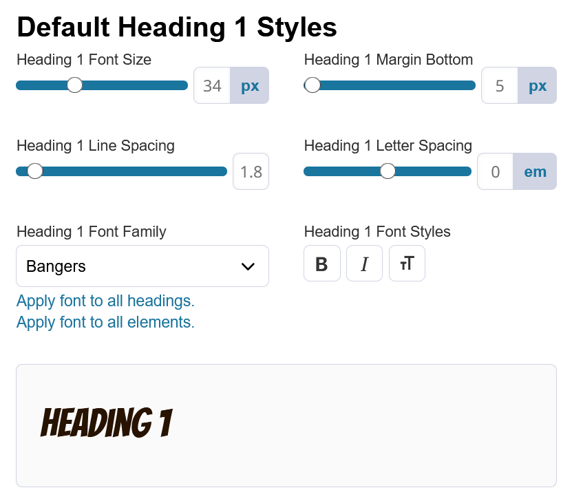
As you customize each text element's default, you will be shown an example of how that text displays.
Global Styles
The Global Styles section provides options for configuring the styles which are used by default across all elements in your store.
Here you can set the default styling Sitewide for Borders, Links, Buttons, and Forms.
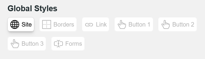
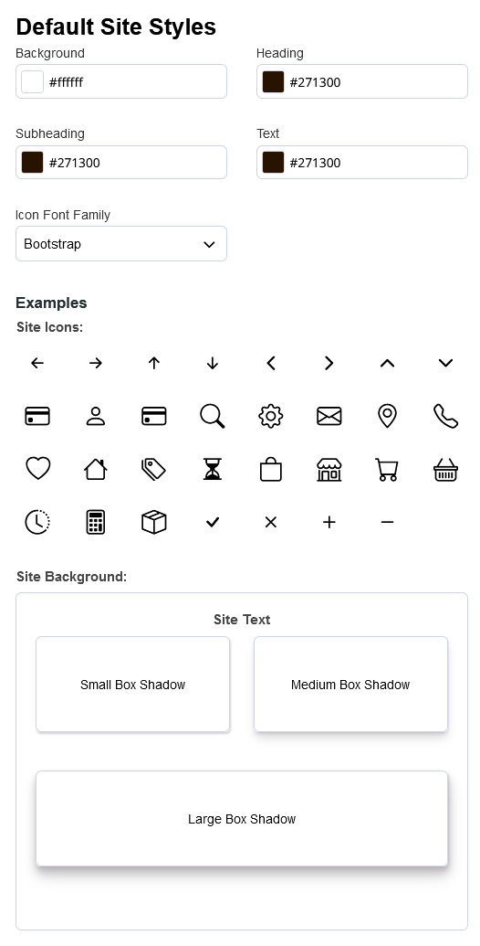
Site
Site styles are the most global. Changes to these styles will effect the defaults for core website styles such as Background color, Headings, and icons.
Borders
Default Border Styles will effect all borders which rely on the global default.
Default Radius, Border Color, and Border Width can all be configured here.
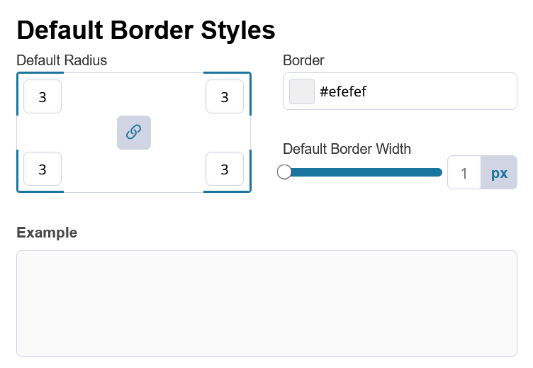
Border Radius controls how rounded the corners are.
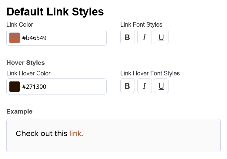
Links
Designing the Links on your storefront is important for creating a consistent design.
You can set the Link Color and Link Font Styles defaults and set changes in color or style when the mouse hovers over the link.
Buttons
Buttons have a large amount of customizability through your Theme Branding.
There are 3 different types of buttons labeled Button 1 through Button 3. You can configure each of them separately as they are used consistently for different parts of the store.
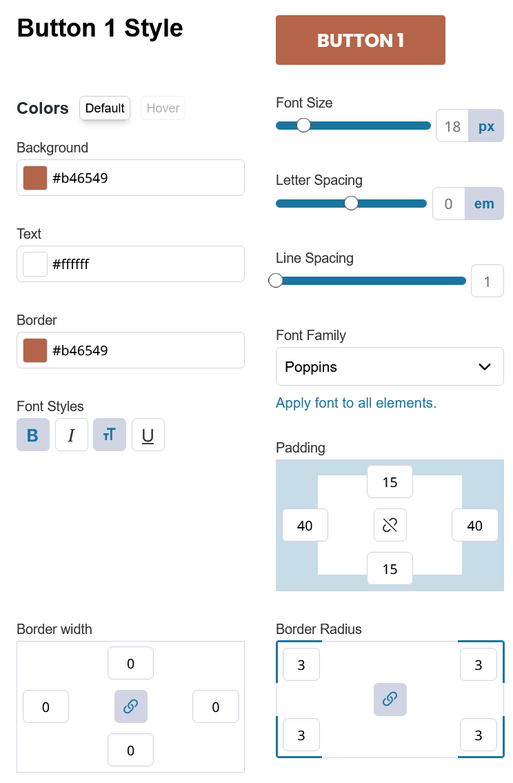
Click the greyed out Hover button to change how the button displays when the mouse hovers over it.
On-hover settings are important for all clickable elements because they are reactive to user input and make the store feel responsive.
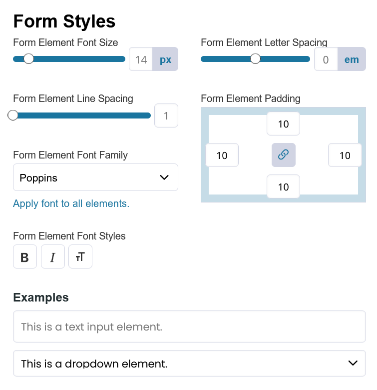
Forms
Forms such as your Account Registration / Request an Account or Contact Us have their own default Form Style settings.
You can configure the Font Size, Letter Spacing, Line Spacing, Element Padding, Font Family and Styles to be used for the text in your Forms.
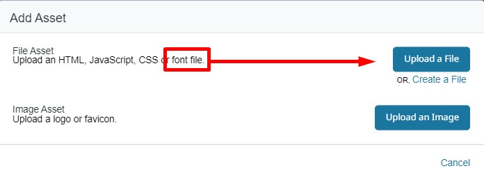
Fonts
In the Asset Manager you can add your font files.
The font file needs to be .woff. TrueFont files will not work.
Click on Add Asset >Upload a File. The corresponding font will be accessible in the Theme Fonts & Colors tool for assigning to global classes.
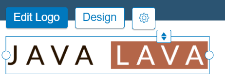
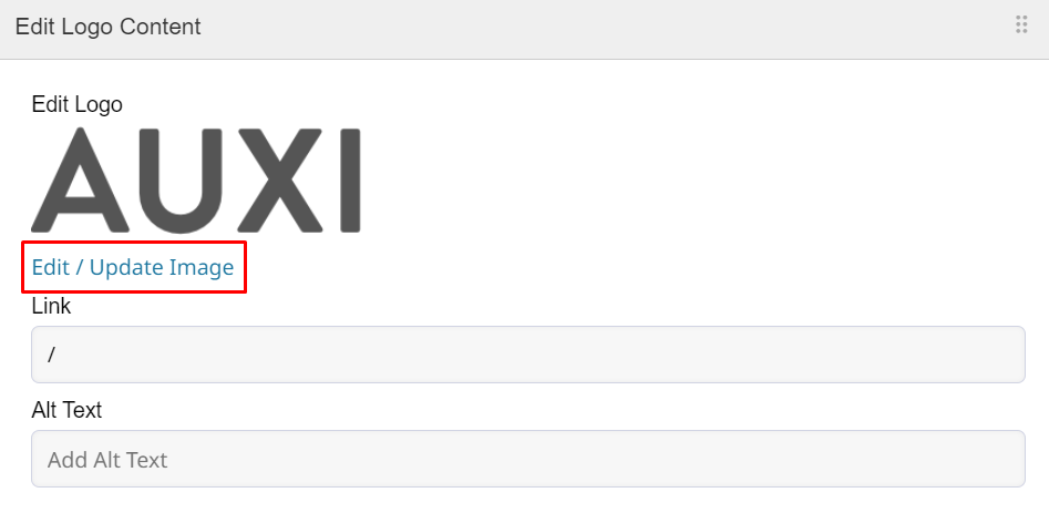
Logos
Your logo may be uploaded to the File Manager for adding to your website, as well as your Customer Portal login page and Theme Assets.
Replace the default logo in your store with yours! Click on the logo, then click Edit Logo.
Updated about 1 year ago