Section 2: Homepage Design
Now that your fonts, colors, and logos are set it is time to begin designing elements of your Homepage.
Header and Navigation
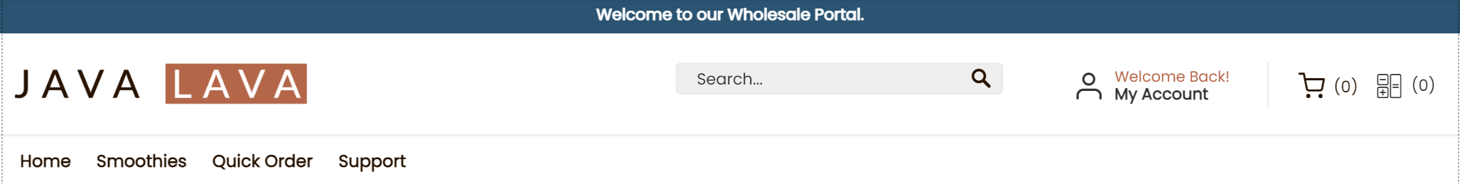
- The header section will appear on every page of your store and is resized for Tablet and Mobile view.
- A header section is typically made up of a Logo, Search Bar, Account Links, Shopping Cart, Quote Cart, and your Navigation Bar.
- Banners are commonly added to the header.
- Visitors on a mobile device will see the mobile header.
How to edit and design components of your store
You can also use custom CSS to design your store!Here is an article which describes how to style your header links with CSS. You can apply CSS styles to any element or page in your store.
If you're not experienced with web design, that's okay!You can use the following Edit & Design options to style each element. No coding required!
When getting started with the Zoey Theme Design Editor, it is good to get familiar with the way you can control each each element.
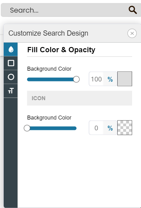
When you click on an part of your store, such as the Search Bar, you can either Edit, Design, or click the gear / cog icon for right-click options.
- Editing an element will give you that components configurable options. When editing the Search Bar, you'll see that you can change the Placeholder Text.
- Designing an element will let you control some CSS properties such as color, padding, font size, and more depending on the object. When designing the Search Bar you can set the background color, border radius, round the corners, and change the text size.
- More Options - Right-clicking the elements or hitting the gear icon provides even more ways to manage these elements.
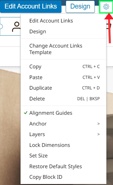
Right-click menu provides access to more visual design features:
-
Changing Template will allow you to swap the template of the selected element, for another which has different default styles and settings
-
Copy, Paste, Duplicate, Delete - Duplicate is very useful for creating new elements with the same design!
-
Anchor - This is an important setting for elements in regards to how they will resize for smaller displays. Elements should be resize based on their position on the page. Objects in the middle should resize from middle. Elements on the right should resize from the right.
-
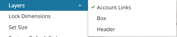
Layers - Incredibly useful option to see, and select, the layers behind the element. When working with Boxes you will want to use this setting to select the box without issue.
-
Lock Dimensions will lock the dimensions of the element so that it will not resize for smaller screens.
-
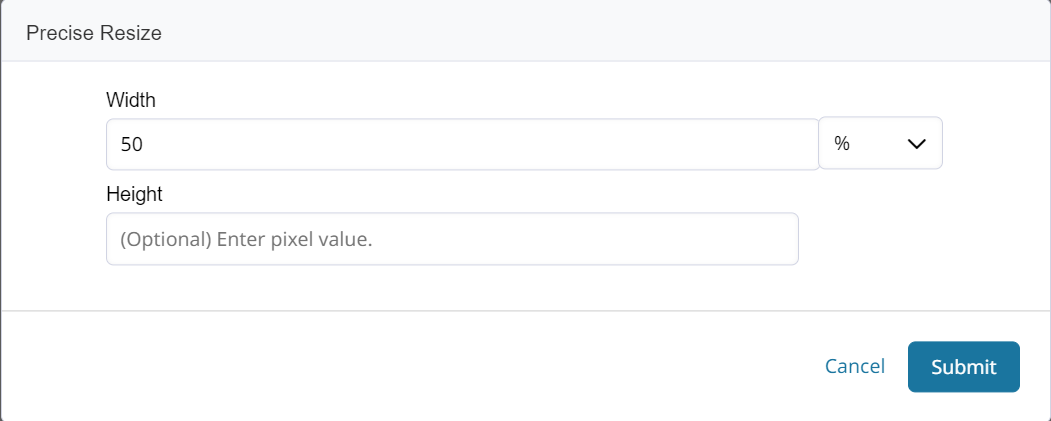
Set Size lets you set the width as percentage of screen or in pixels.
Editing Account Links and Carts
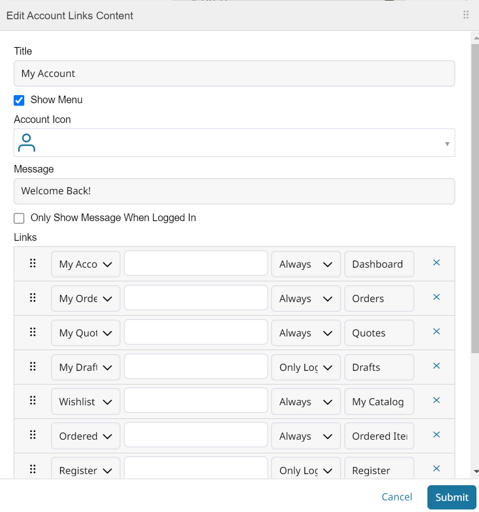
Do not remove Account Links from your header!It is mandatory to have this element in header for mobile view.
- Account Links
Editing Account Links lets you change the Title, Icon, Message, and the Links which appear in the menu.
Designing Account Links lets you change background color, borders, text color & size of primary and secondary text. You can also set on-hover colors and control the padding / spacing of list items.
A Note on PaddingPadding is used to generate space around an element's content, inside of any defined borders.
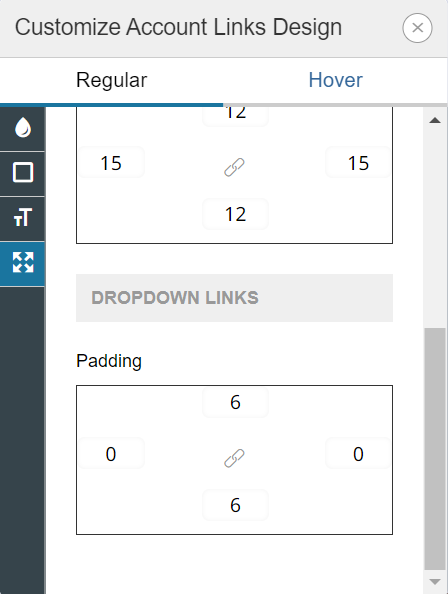
You can adjust the space given to drop down items by changing their Padding.
Quotes mini cart can be removed from your header if Quotes will not be enabled on your store.
Moving objects around the page
When you click on an element, it will be selected. The component, or entire section, can be moved by dragging it around.
You can also use your arrow keys to move the selection by a single pixel.
When moving the objects you will see guidelines to assist with lining everything up. You can also see the padding enforced in that section, visible as the diagonal grid bordering useable space.

- Your header should provide access to central features and navigation for your store.
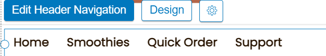
Header Navigation
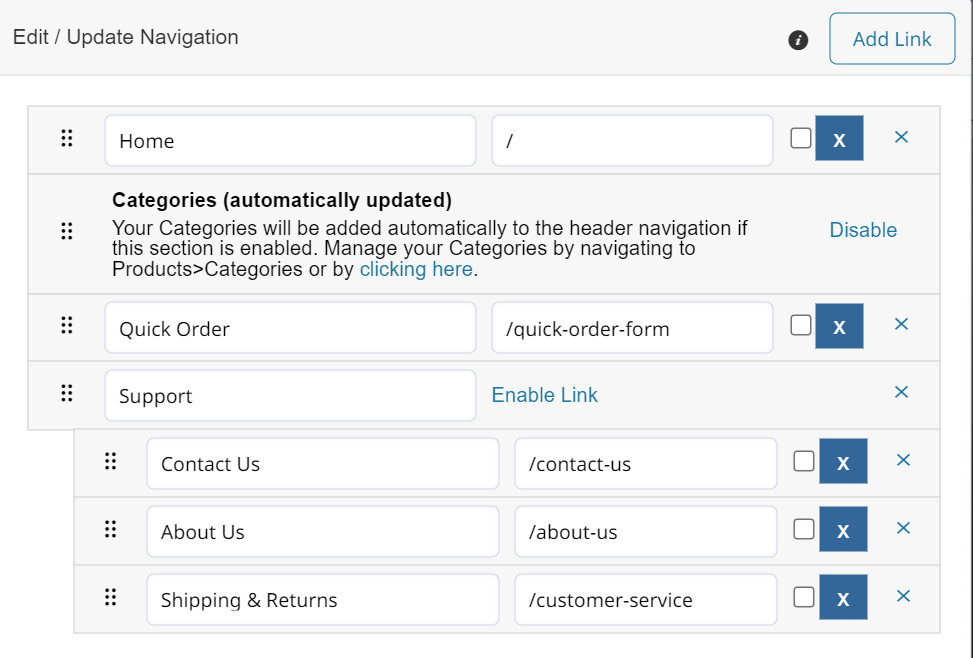
Links to your categories will appear in the header depending on their settings. Click here for the category set up guide.
Other links can be added by clicking Edit / Update Navigation.
Designing your navigation bar can be simple. Here are some examples of how you can change the nav bar.
- Modify the positioning and size of links by changing the text's properties. You can also control how sub-category navigation displays by adjusting SUB LINKS (1ST LEVEL FROM TOP).
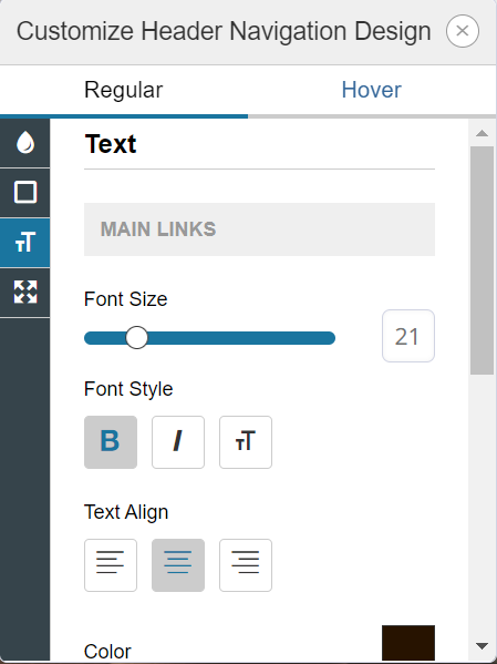
- You can add space between the links by increasing the horizontal padding.
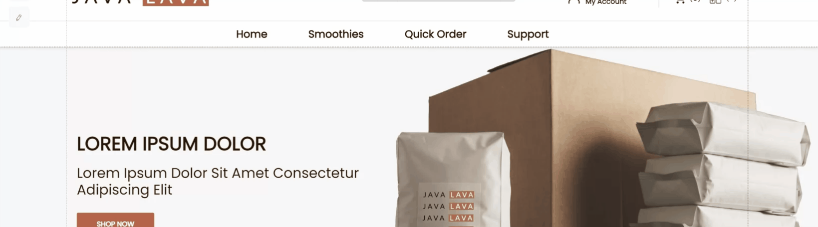
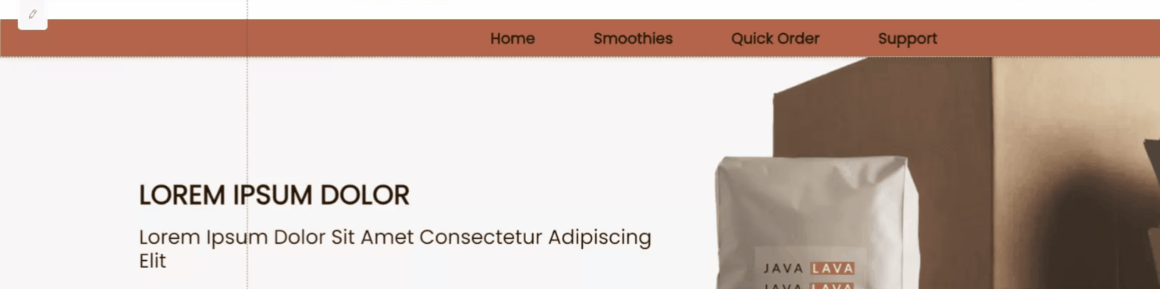
- To add a background color to the navigation bar you will also need to add it 3 times. To the Navigation Bar, the Links and the Box behind them. This is because each area is controlling its own color, and they are stacked atop each other.
- Since the background is now much darker, we should lighten the text to keep it visible. You also want to set an on-hover color so that the links are reactive when someone puts their mouse over them.
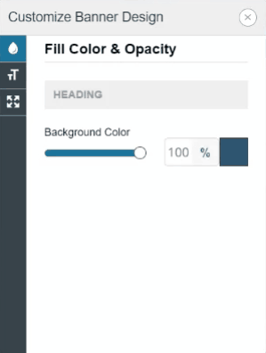
Banners
Banners can be added to the header, or onto the body of each page. They are useful for displaying any message you want your customers to see.
When editing a banner, you can add text through a WYSIWYG editor. But you should refrain from applying colors and text size there, as it is available when designing a banner
Homepage Body
Use Boxes to keep elements together, and in respect to one another, no matter the platform: Desktop, Tablet or Mobile.
Your homepage can serve a variety of purposes. Customers often want to:
- Display graphics with information about their business.
- List their most popular, or newest products.
- Inform your customers about sales and promotions.
There are many different elements you can use to design the body of your store. For information on the Add Menu and the elements it offers, click here.
This guide will focus on adding Slide Shows, Images, and Product Lists.
Boxes and Images
Boxes can be used to organize the elements within a section of the page. Elements in a box will be displayed together. Typically, all elements are rendered to the page from left to right.
Here is an example of using Boxes on your store to organize Image formatting:
-
Add your first Box from the Building Blocks section of the + Add Menu.
-
Adjust the size of that box. We will use the right-click menu to Set Size as a 50% of the screen.
-
You can then right-click Duplicate the box and move it so that each box takes up half the page.
-
Boxes can be given a background image, background color and spacing.
Slide Shows
See how to add and edit Slideshows here.
There are a few types of slideshows you can add to your store. They are:
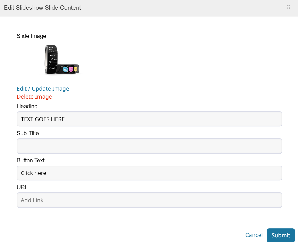
- Image Slideshows provide a default configuration of the image and text placement for the slideshow. You can change the images, texts, and buttons of each slide by editing. These slideshows will automatically resize for mobile.
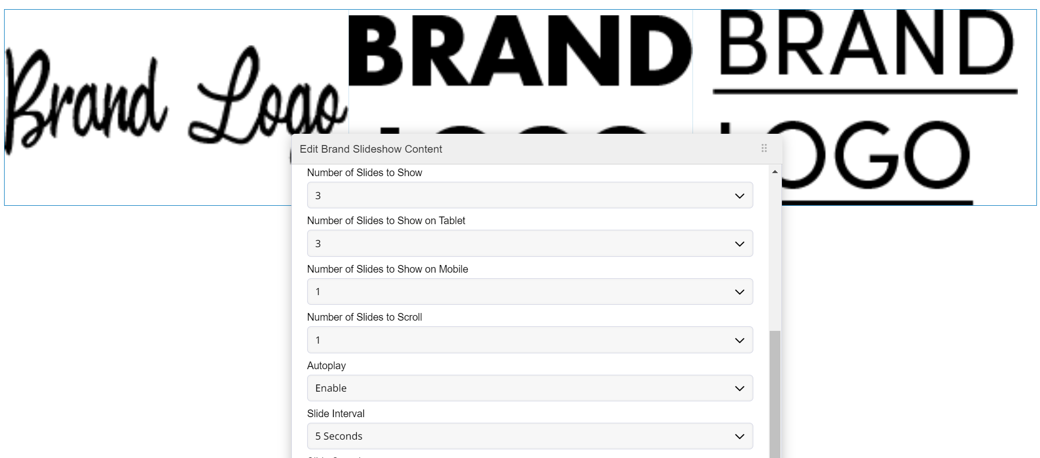
- Brand Slideshows can display multiple slides at once. Rotating through them at the set intervals. You must set how many slides to display on tablet and mobile to display properly on those devices.
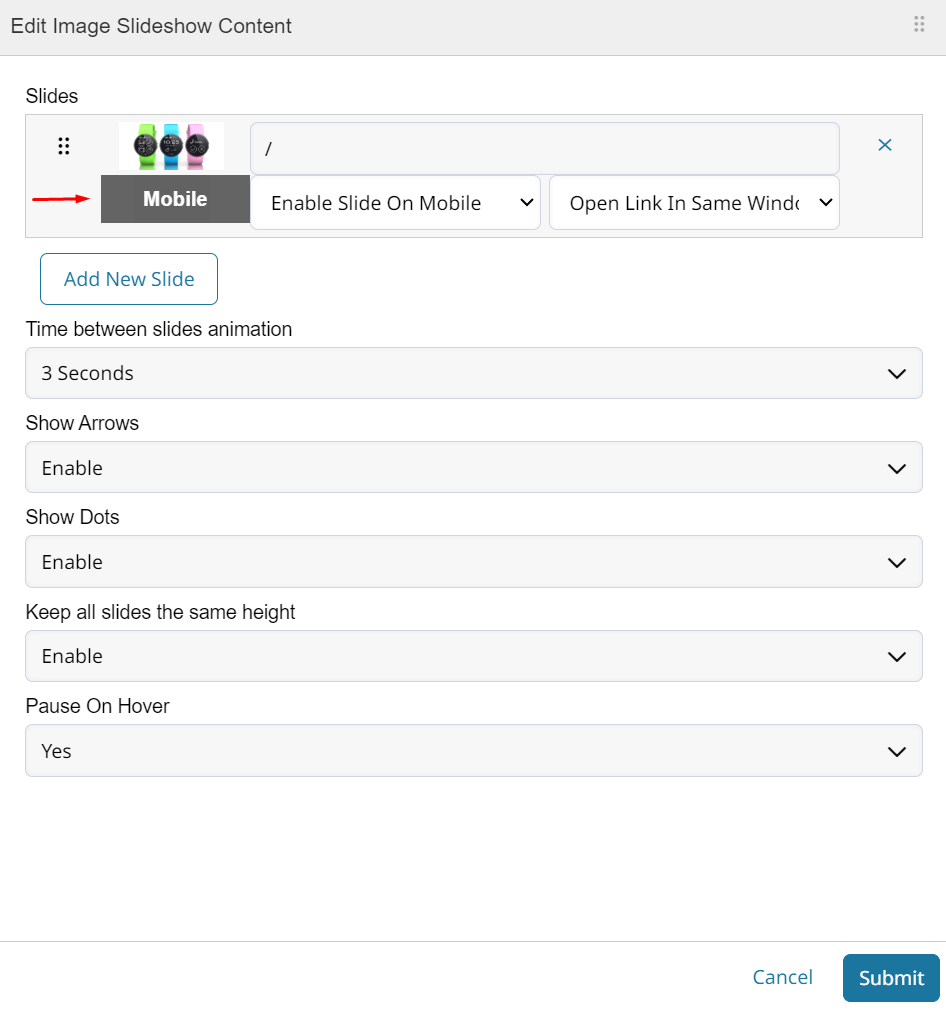
- Image Only Slideshow can only contain images. But it also enables you to set slides as mobile only so that only pictures intended for that size display. The slides can still redirect visitors when clicked. Here is an article on adding a mobile only slide to your show.
-
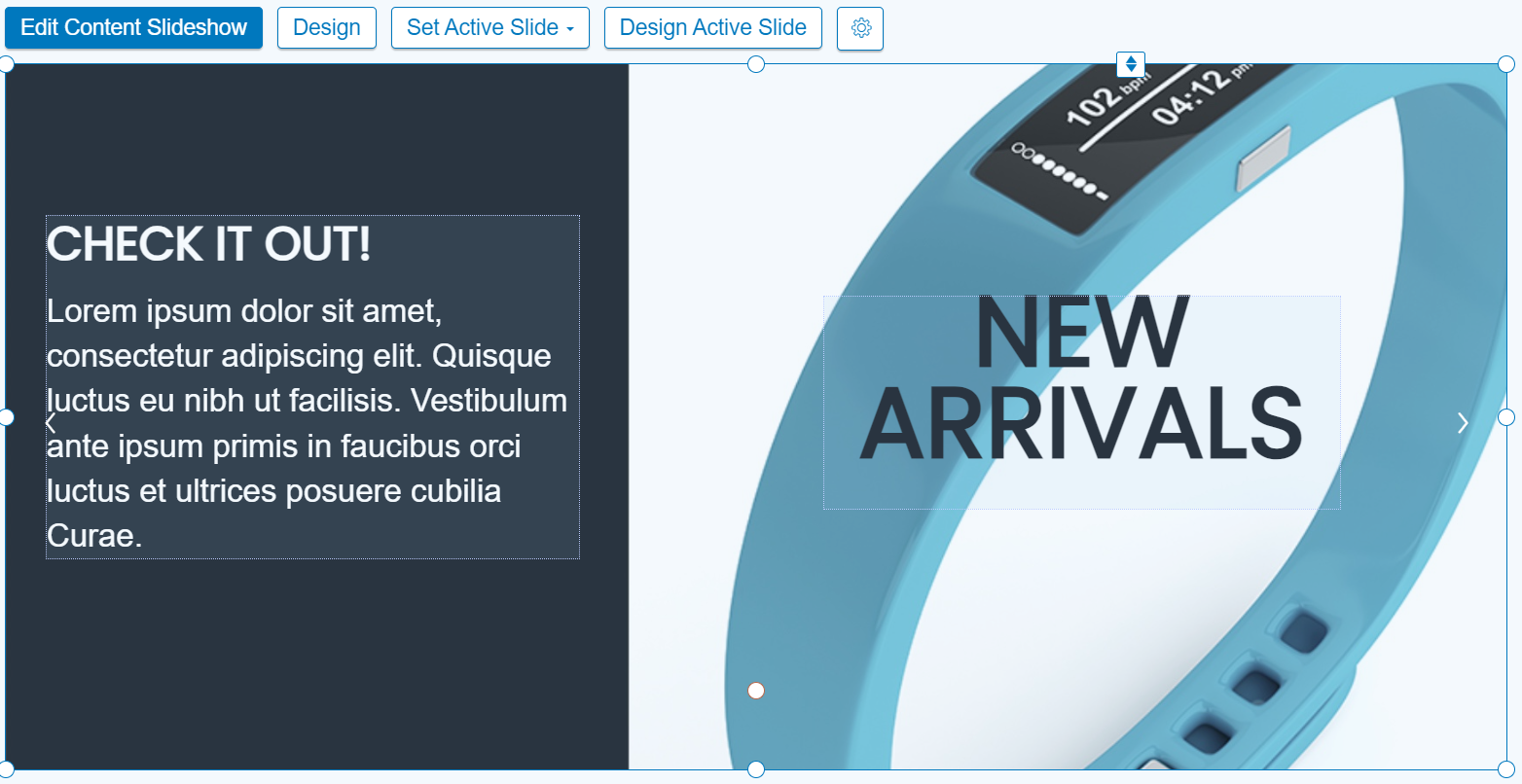
Content Slideshows let you add any element to a slide of the show. You'll also need to set the mobile formatting for each slide. This type of slideshow is the most customizable. You can even add newsletter sign-up!
Product Lists
Products Lists will display your product(s) so customers can add to their carts from your homepage. There are 4 elements you can choose from. Learn how to add a product list here.
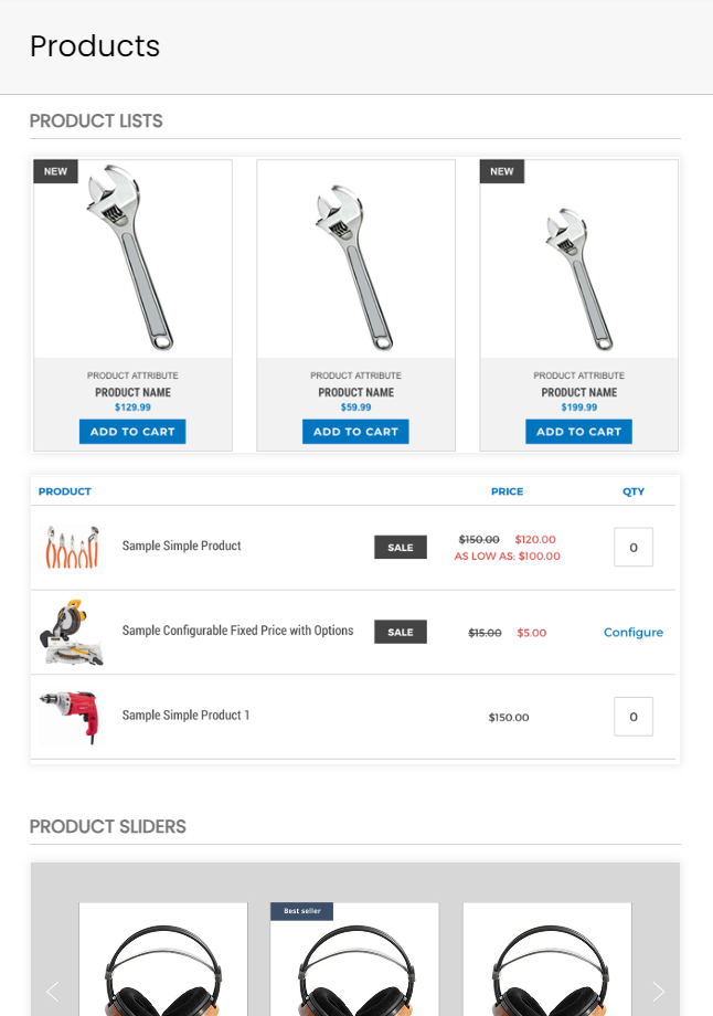
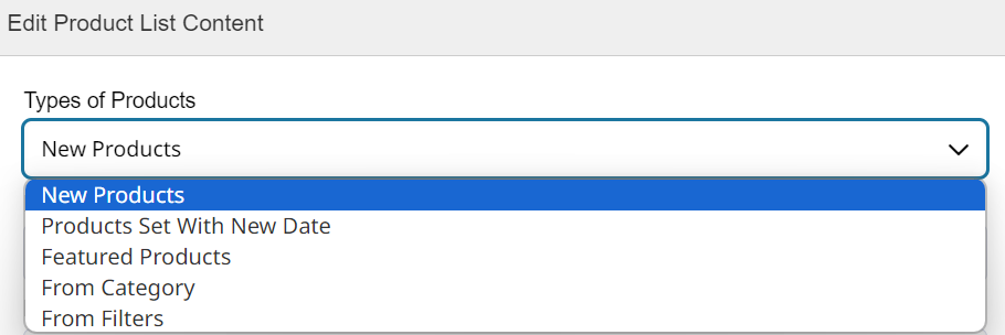
Each Product List element can display different types of products.
- Table View displays your products as cards in a table/grid.
- List View displays products as rows in a list.
- Product Slider is a carousel element that will cycle through products.
- Single Product lets you add a single product card element.
You can have additional pages for custom product lists! Click here to learn how to create pages with custom order forms.
Footer
Your store footer will contain links to pages such as your Shipping and Returns policy. It can also display your Address, Phone Number, and more!
Updated about 1 year ago