Theme FAQs
We have many resources to help you manage your storefront!
Click here for an index of Theme Design Resources.
Changes to your theme do not auto-save and cannot be reverted once saved!
Before making changes to a live page, duplicate the page and edit the copy.
You can publish the test page to view your edits. The page will have a unique URL which isn't exposed to the live store. This way, your changes won't affect customers browsing your store.
What is the Recommended Image Size?
How can I display a Product Attribute on the Product Page?
How to Edit Text on Non-Editable Pages
How to Sort the Attributes in my filters?
More Theme Questions and Answers
- How do I change the dots color on a slider?
- How do I adjust button sizing?
- How do I adjust nav header spacing?
- How do I make fonts bold on buttons?
- How do I change the background color of my nav?
- How do I change the font styles of my product grid?
- How do I change the weights of certain levels of my nav?
- How do I adjust the spacing between my tabs?
- How do I change font styling for Related Products?
- How do I style the filters/forms?
- How do I change my product name styling?
Answer: Edit The Design Of The Block
- How do I hide the product reviews element?
- How do I manage what's shown on my category page product grid?
Answer: Edit The Settings Of The Block
- How do I globally style headers?
- How do I make my fonts consistent?
- How do I change the spacing of my description copy?
- How do I adjust button sizing?
- How do I change the button color?
- How do I make fonts bold on buttons?
Answer: Edit The Theme Fonts & Colors
- How do I change font choice and sizing in WYSIWYG blocks?
Answer: WYSIWYG Styles should inherit from the Theme Fonts & Colors.
However, WYSIWYG may have "inline-styles" that are causing unanticipated problems. Please Submit A Ticket If you are having issues with a WYSIWYG Text field that you can not resolve.
- How do I adjust the spacing between elements on my product page?
Answer: If you can not adjust spacing within a block by Editing The Design Of The Block, you may have encountered one of the numerous updates or fixes made to the design blocks.
If the spacing issue is causing a problem, please Submit A Ticket. Otherwise, this is simply a change that can not be undone.
Edit the Design of the Block
If you notice any of the above issues related to design/styles, the first thing you should do is go into your visual design editor, click on the block in question, and click the "Design" button.
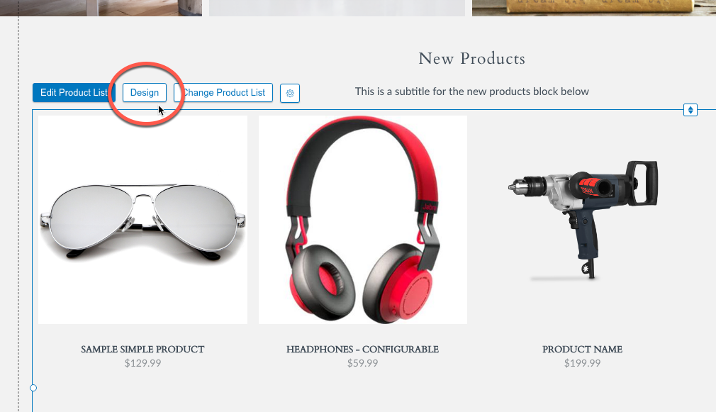
Click on the block in question, and click the 'Design' button.
Next, you can fix different issues using the Design Window. Select one of the tabs to find design settings for different elements of the block you are editing.
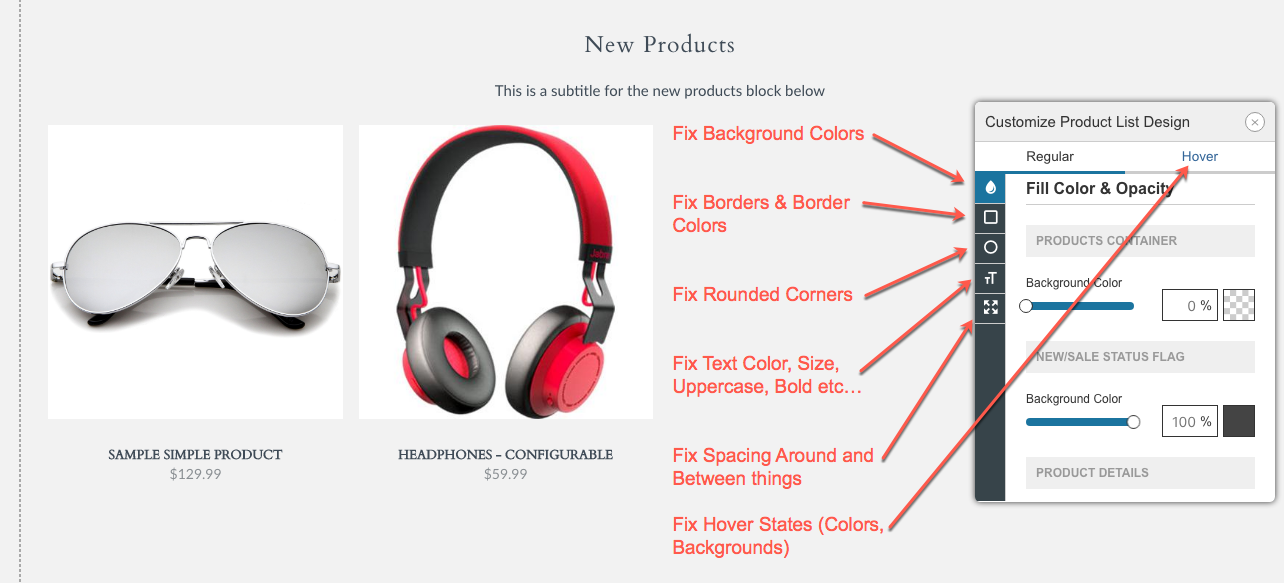
- Drop Icon - Fix/Change Background Colors, Button Colors,
- Square Icon - Fix/Change Border Colors and Size
- Round Icon - Fix/Change Rounded Corners
- Txt Icon - Fix/Change Text Differences (Color, Size, Bold, Italic, Uppercase, etc...)
- Arrows Icon - Fix/Change Spacing Issues (Padding, Margin, Spacing between objects etc...)
Edit the Settings of the Block
If you notice an issue where something new is showing up within a block, or some piece of a block is now missing, the first thing you should do is go into your visual design editor, click on the block in question, and click the "Edit..." button.
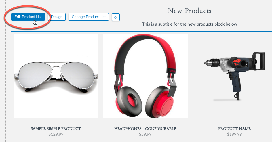
Click on the block in question, and click the 'Edit...' button.
This will show you all of the "Settings" as well as places you can add "Content" to your block.
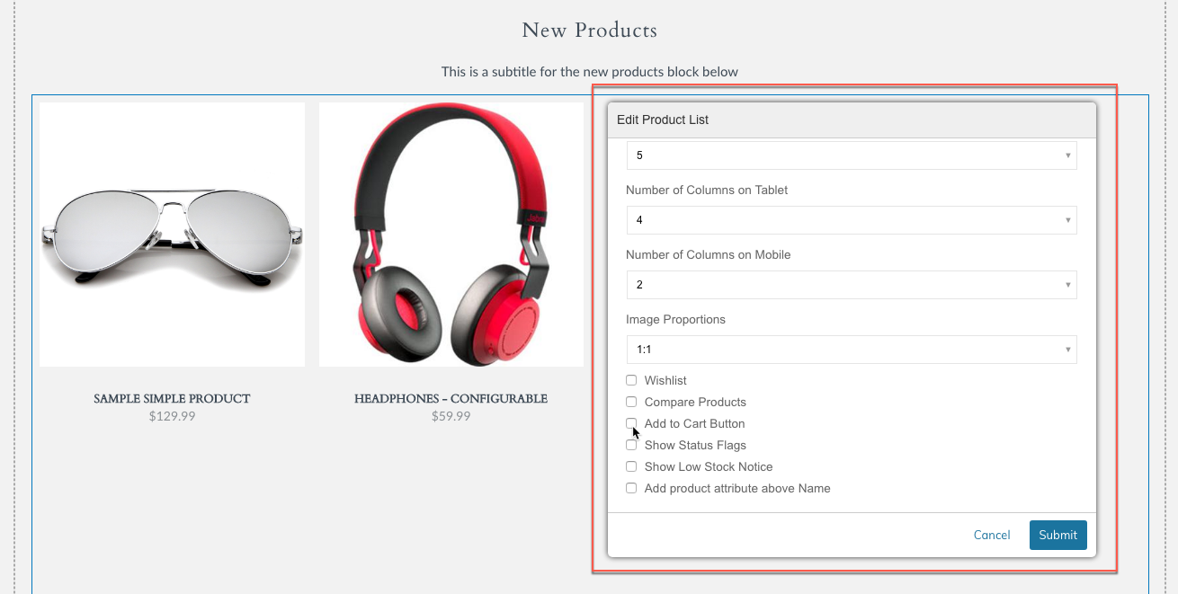
Change the corresponding setting, click "Submit" then Save or Save & Publish.
Edit the Theme Fonts & Colors
Theme Fonts & Colors is a new section that allows much more control over the default colors, fonts and font settings used throughout your theme. This section can be used to fix things that you may not find in the Block setting itself. Go into your visual design editor and click on the Gear Icon to select the Theme Fonts & Colors Option.
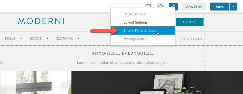
Click on the Gear Icon to select the Theme Fonts & Colors Option.
This will open the Theme Branding tool where you can edit the below sections:
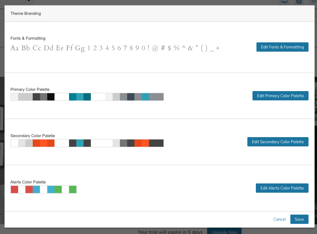
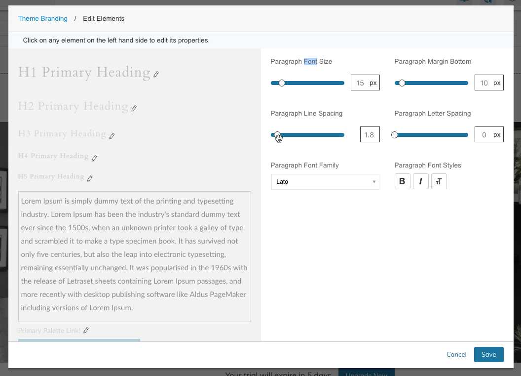
| Fonts & Formatting | Control the Font settings for H1 - H5, Paragraph, Links, Buttons and Form Fields. Control the Default Font Size, Margin Bottom, Line Spacing, Letter Spacing, Font Family and Decoration (Bold, Italic, Text Transform) |
| Primary Color Palette | Control the Default Colors for Background, Headings, Borders, Text, Links, Buttons and Forms. Hover State, Borders, and other color settings are also specified here. |
| Secondary Color Palette | Not applicable for migrations. Only used on new themes. |
Updated 12 months ago